Do I really need a responsive website?

As mobile usage rises, the chances that someone will access your website from their smartphone rather than from a desktop browser get higher and higher. There’s also a good possibility that if they can’t find the information they need right away or if they can’t use your website at all from their phone, they will find what they need somewhere else (possibly from a competitor!) That’s why it’s so important to make sure your website works as well on a phone or tablet as it does on a desktop PC.
What does responsive mean? Is it the same as a mobile website?
A mobile website is a second version of your website that is created and optimized for a mobile device. Because it is a different version completely, all of your content and features might not be available. In some cases, this is fine, but in general, it is a good idea to make sure all content is available for all visitors, not just the ones that are coming to your website from their computers. This is where responsive web design comes in.
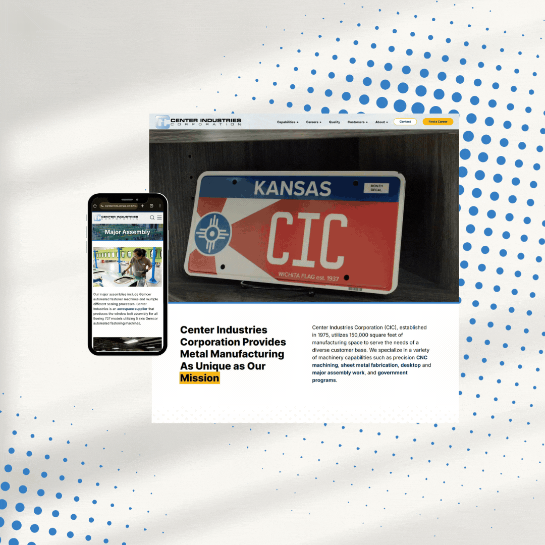
A responsive website is programmed to change and adapt to the device it is being viewed on. That means that it will look differently on a phone than it does on your computer even though it contains the same information. The most important pieces will be emphasized and easy to find (such as your phone number or address), while other, less important pieces, will still be there, but won’t stand out quite as much.
While both options may seem the same, a mobile website is typically more static and designed to fit a certain size. That works in many cases, but it doesn’t necessarily help visitors on their iPads or tablets, and, as phones change and become bigger (or even smaller), it could quickly become out-dated. A responsive website, by design, changes based on screen size, so it will work no matter what the specific dimensions of a user’s screen are. This means you’re covered on future screen sizes as well as on a variety of handheld devices.
What if my website doesn’t work on a smartphone at all?
Lee Media Group can help! Contact us today, and we will evaluate your website’s current mobile performance and let you know what we can do to help your business reach more potential customers.